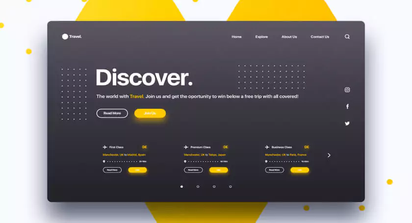
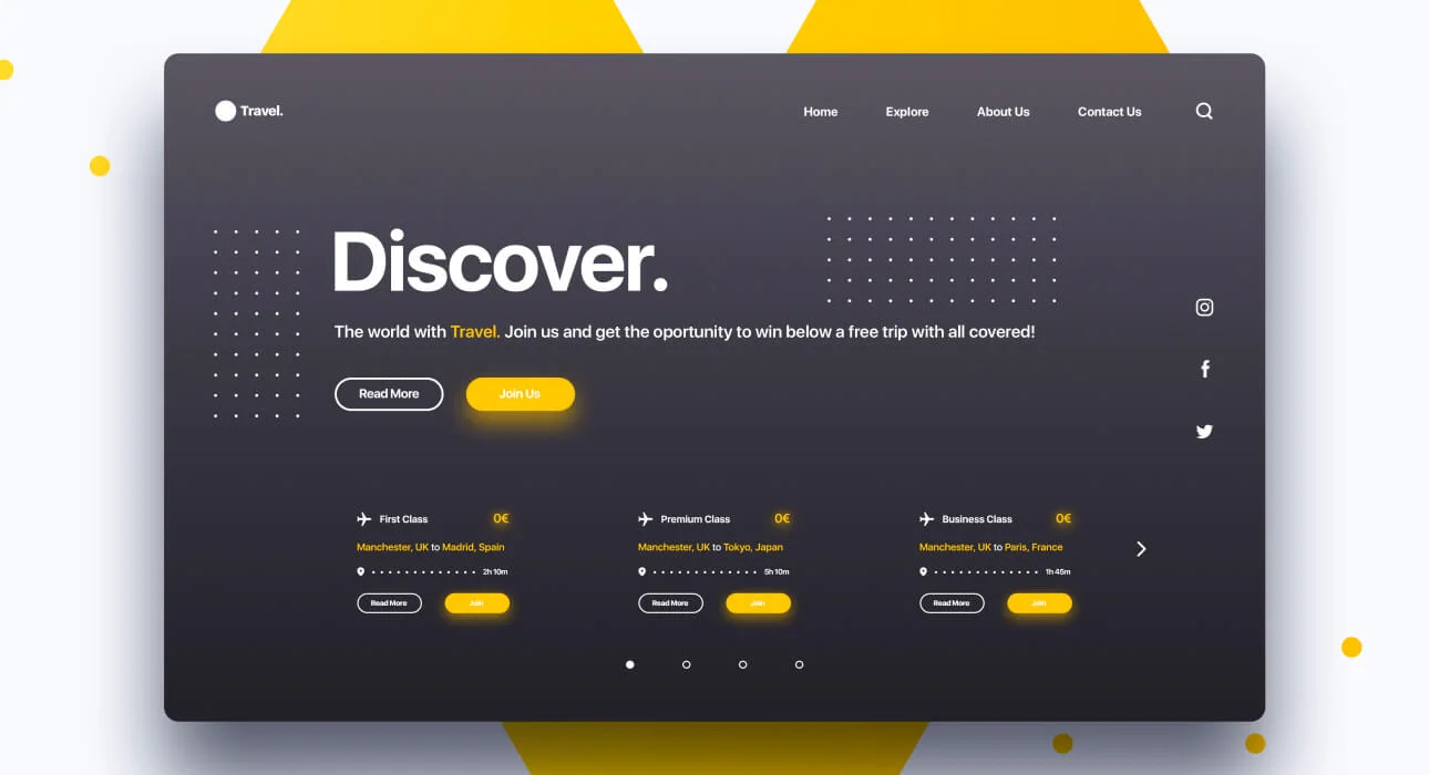
Minimalism combined with elements of french typography and brutalism helped us to realize the site exactly as we imagined with the client at the beginning: visually restrained, but stylish. Informative and pleasant to use, with an elegant aftertaste of a serious financial institution. Combined with elements of french typography and visually restrained, but stylish. Informative and pleasant to use, with an elegant aftertaste of a serious financial institutional client, and close collaboration.
Advantage
Accomplished
Marketplace startups
SaaS startups
Typography
The basic idea was to find a balance between the thin, wispy sans-serif used to indicate a ‘futuristic‘ tone, and a bold, masculine font synonymous with ‘construction‘. We came up with something in the middle, leaning towards lighter-weighted fonts, but still with a hint of that blocky ‘construction’ vibe. We use Chaney for general display and when we want to drive attention to the content, and the technical and geometric Sora font for the body copy and paste overall hierachy.
Conclusion
client, and close collaboration, we could work on this project quickly, launching the brand and the initial holding page of approximately four pages in five weeks – just in time for their press release. Further pages.
This positioning was also considered when defining the color palette. Smoky Black represents trust and confidence while vividly contrasting against light backgrounds, whereas purple represents innovation.